Thursday, April 26, 2007

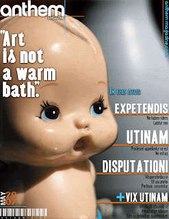
Anthem Magazine Layout: Cover & Table of Contents


This assignment was originally for another class this semester: art direction and design. The assignment was to design three different Anthem Magazine covers. Though I did design three different covers, the cover I am submitting here was not used for my other class. Since having the Anthem assignment, as well as learning about Adobe Creative Suite, I have been practicing my design abilities with any spare time I can. This submitted cover layout is truly does reflect my improvement in designing. But I will not lie either, it can still be challenging too.

Also, I felt that submitting just the cover layout by itself was not substantial enough. So, I decided to also design a table of contents, extending the design theme shown on the cover (color, shapes, fonts, and even the same words). Especially compared to my original executions for this assignment, I truly have come a long way.

Monday, April 23, 2007

Tom Waits Concert Poster


I have always been a big fan of art nouveau style, especially the posters. While brain storming for this project, I thought of Tom Waits, the musician, and knew right away I had to incorporate him into this execution.

I created this concert poster by using both Photoshop and Illustrator. The found the illustration of Tom Waits online, it was origionally created
by Thomas Boatwright. I edited the illustration colors in Photoshop, and then exported the file to Illustrator. The rest of the poster was created entirely in Illustrator, using a variety of fonts I had downloaded.

This project was the most fun to make out of all of my submissions.

Sunday, April 22, 2007

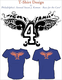
T-Shirt Design - Koman Race for the Cure


I was asked my by my boyfriend's mother to design a t-shirt that could be worn by her famliy this year's annual Philadelphia Susan Koman - Race for the Cure. The requested slogan was "Fight for Family". While designing this t-shirt I kept in mind that it would be worn by various members of a family, men and women, and ages ranging between 5 to 60 years old. I sketched a "prinken map" to get a feel for what kind of elements I had to work with. So, after a while, I saw that two letter "f"s could blend into being wings. I also thought, that since this was for a marathon, using the number "4" in the center of the design would be clever (like a varsity jersey). I designed this T-shirt in Illustrator, using a downloaded Hanes textile color swatch, as well as a t-shirt template for printing size and to make a display example. I'm sorry to say that the t-shirt itself will not be finished by the time my portfolio is due for the class. But I am overall very happy with the result.